One of the great things about Google's Android operating system for smartphones is that it is an open platform. To explain this simply, if you don't like anything or you just feel like it, you can change it. This applies from the simple appearance to core functionality and applications.
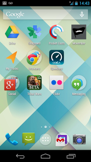
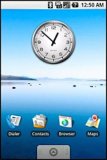
One of the components of Android is an application called "Launcher" that deals with the main user interface and look and feel of the homescreen and application drawer. The most common launcher layout is usually a horizontal homescreen you can scroll through where shortcuts and widgets can be added and a vertical scrolling application drawer. This is the user interface that has been in use since the first Android device released to the general public in 2008, the G1.
 |
| A Classic Android Homescreen |
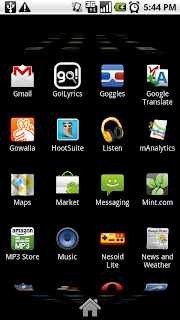 |
| An Android Application Drawer |
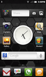
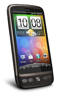
When Android smartphone manufacturers personalise the Android operating system, they often change the launcher or replace it with a new one, usually with added functionality and sometimes changing the user interface. Most manufacturers only change things slightly and add extra functionality (such as HTC with their Sense user interface, Motorola with MotoBlur and Samsung with TouchWiz). This helps them differentiate and brand their products.
 |
| HTC Sense Homescreen |
 |
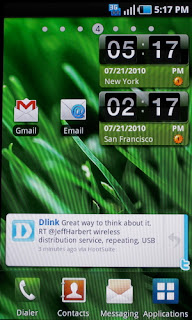
| Samsung's TouchWiz Homescreen |
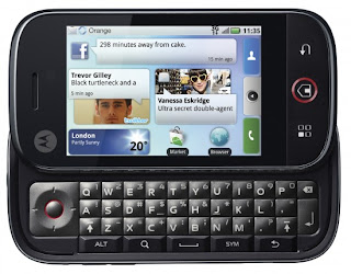 |
| Motorola's MotoBlur Homescreen |
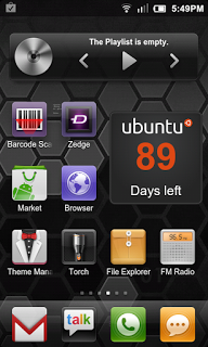
The Android developer community has also developed many different launcher applications that replace the ones that come preloaded on phones. Often they are variations on the same user interface offering easier theming (changing colours, backgrounds, icons), less usage of memory and processor power (my favourite is Zeam Launcher), or completely different user interface and functionality (such as SlideScreen).
 |
Zeam Launcher's Homescreen
|
 |
| Slidescreen's Homescreen |
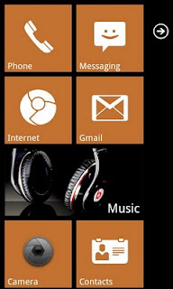
For the last few days I have been using a new launcher that imitates the Windows Phone 7 operating system's user interface called Launcher 7. At launch, Windows Phone 7 was not customisable in any way by manufacturers as far as the user interface was concerned. It has a tiled, minimalistic but functional user interface. Launcher 7 is easy to download from the Android Market and install on your device. Once it is installed just hit the Home button and you are usually given an option to choose which launcher to use: the one that was in use up until now or Launcher 7.
 |
| Launcher 7 Homescreen |
 |
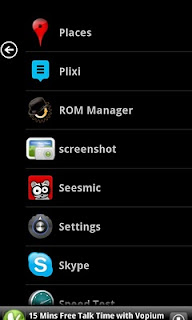
| Launcher 7 Application Drawer |
I enjoy the sense of humor of the author of this launcher because he has replaced icons on tiles such as the Internet Explorer one with a Google Chrome one, and the Windows Marketplace with the Android Market. Launcher 7 is extremely functional (as is the UI of Windows Phone 7), and runs very, very smoothly on my HTC Desire. It does get easier to operate once you are used to it, and it is fun to confuse other phone geeks with by making them think you are running Windows Phone 7 on your Android device.
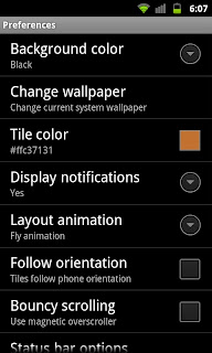
There are a large number of settings that are personalisable, such as adding tiles, changing the tiles colours and how icons appear on the tiles. You can also choose to hide the Android status bar to have a full screen experience.
 |
| Launcher 7 Settings Menu |
Launcher 7 is available to download from the Android Market, and is fun to play around with. Try it out and see how you like it. You may decide to stick with it, or maybe even change your mobile device for a Windows Phone 7 one... I'm definitely not going to do that unless someone gives me one for free! (wink, wink, nudge, nudge Nokia!)
Feel free to post comments/questions!
