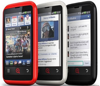
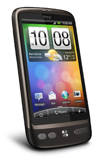
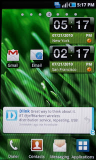
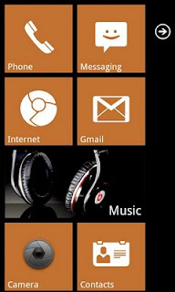
As many regular readers of this blog know, I'm a big fan of budget Android devices. Google's Android OS is an open source operating system that manufacturers (and users) can modify to their liking and adapt to needs and/or devices. Many of you may have heard of or seen HTC Sense, HTC's take on Android's UI, or Motorla's Motoblur, or Samsung's TouchWiz. In a similar fashion to how these major players in the smartphone market skinned and adapted Android for their smartphones, INQ did so to create a new Android experience on the INQ Cloud Touch.
The INQ Cloud Touch is a relatively inexpensive Android smartphone which has social media and the mobile internet at its core. Facebook passes from being an application (and/or web app) to an integral part of the device. People who use/live on Facebook will feel right at home with the INQ Cloud Touch as it is probably more of a "Facebook Phone" than the HTC Cha Cha or the HTC Salsa in my opinion.
 |
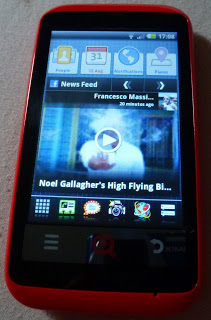
| The Main Homescreen - Facebook Rules! |
The main homescreen of the INQ Cloud Touch is comprised of a group of custom Facebook widgets: a large Facebook News Feed (browsable) and above it a widget of your favourite Facebook contacts, one of your integrated Facebook and Google Calendar, one for your Facebook notifications and one for Facebook Places (Facebook's answer to Foursquare and/or Google Places). At the bottom of the homescreen there is a static dock that appears on the other homescreens you can slide through. The other homescreens are customisable but come pre-populated out of the box with a Spotify widget and the most popular pre-installed apps (Twitter, Windows Live Messenger, Facebook Messaging, Youtube, GMail).
Facebook is not the only service that INQ wove into the DNA of the INQ Cloud Touch. I was pleasantly surprised to find Spotify as the default media player on the INQ Cloud touch. As well as playing media files stored locally you can also stream your Spotify playlists if you have a Spotify Premium account.
 |
| Spotify Playing TWiG (local file) |
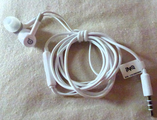
Plugging my favourite headphones into the INQ Cloud Touch wasn't a problem as the device has a standard 3.5 mm headphone jack. In the funky box you also get a very iLike white set of headphones with microphone. I definitely liked the headphones that come with the INQ Cloud Touch as they are earplug style ones. They even come with size adapters for the plugs!
 |
| The INQ Headphones Bundled With The Cloud Touch |
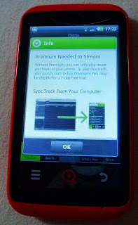
Sadly I can't afford Spotify Premium at the moment, so all my cheesy Spotify playlists have been there in the Spotify media player reminding me of their existence (and teasing me as well as tempting me to subscribe to Spotify Premium).
 |
| Tempting, oh so tempting. Spotify Premium Needed! |
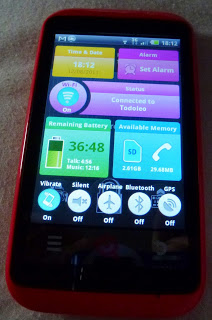
Battery life was pretty good on the device. In my day to day use it lasted long enough to get me through the average day. Mainly I use the device for social networking (Google Plus, Facebook and Twitter), Email (GMail), IM (GTalk) and as an mp3 player for listening to podcasts while I walk to work. Managing battery life was easy with the power and service monitor launched by the dedicated button on the left hand side of the phone.
 |
| The Power Control Screen (Launched by Info button) |
As well as everything that comes set up and ready to go on the INQ Cloud Touch, it is an Android phone, so installing your favourite apps and games from the Marketplace is easy peasy. Angry Birds played smoothly and was entertaining on the INQ Cloud Touch. I must admit that I have almost stopped using Facebook and reduced my usage of Identica and Twitter since the launch of the Google Plus field test. As well as the Google Search widget, I installed the Google Plus widget and a few more apps such as Foursquare. Performance of all these apps was great and I didn't really have any problems with them.
I have now been using the INQ Cloud Touch for more than two weeks as my primary smartphone and have not really had the want (or need) for anything more powerful (or expensive) than the Cloud Touch apart from in the camera department.
 |
| The shiny red back of the INQ Cloud Touch with 5MP camera. |
On the shiny red back of the INQ Cloud Touch there is a 5 Mega Pixel snapper (without flash of any kind). I didn't like the results of the camera and the lack of flash for it is definitely a negative point. The nightclub frequenting iPhone or Blackberry user (
who Frank Meehan mentioned...) wouldn't be able to take very good pictures if they were to upgrade to an INQ Cloud Touch. Sharing and sending the pictures would be extremely easy with whichever service you please. Google Plus Instant worked a dream with the pictures taken, but sadly not many were worth sharing.
 |
| A Picture of @fatoldgingercat taken in optimal light conditions with the INQ Cloud Touch |
Here's the geeky technical paragraph of the review you can skip if tech specs don't rock your boat: the INQ Cloud Touch runs on a 600 MHz processor, which is pretty smooth and responsive on Android 2.2. The crisp 480x320 screen is encased in solid feeling plastic and the chin at the bottom of the screen has three buttons (Menu, INQ Home and Back). The smartphone comes with a 4GB MicroSD card and you can expand the storage on the INQ Cloud touch up to 32 GB (I tested it with my card and it worked fine). The smartphone is a quad-band GSM device so it will happily work in the US of A on GSM networks too, and it also does HSDPA (3.5G for us Europeans, 4G for Yank marketers...). The speaker on the back and speakerphone performance are excellent. The INQ Cloud Touch is available in red (as my review unit is), white and black.
Right then, time to wrap up this long review with some sort of conclusion. I have been a fan of INQ since my experience with the
INQ Mini 3G. I liked using the INQ Cloud Touch and enjoyed using it as my main smartphone. Battery life was good, performance was good and once I got used to INQ's UI I forgot I was reviewing a phone most of the time. If you are a Facebook addict or someone who is afraid of technology but are used to Facebook, this is definitely the phone for you. The INQ Cloud touch is easy peasy to use and a fantastic first smartphone. It is affordable, fashion conscious and powerful enough to last a while. I'll be sad to send the INQ Cloud Touch back.
Quick disclaimer: the INQ Cloud Touch I have been using is a review unit provided to me on loan by the friendly people at INQ. I received no payment for this review and remained as impartial as any INQ fan can when reviewing their products.
Leo Laporte vs Mike Arrington moment averted...
Find out more about the INQ Cloud touch
here.
As usual, feel free to leave comments and/or questions. If you liked this review please Google +1.
