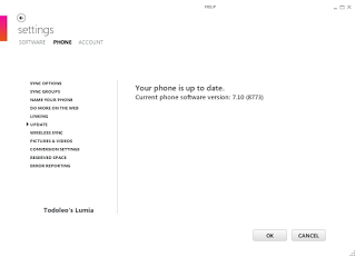
At the end of January Microsoft started rolling out the Windows Phone 7.8 update for devices that had previously been running Windows Phone 7.5. Windows Phone 7.8 is an update that gives you a Windows Phone 8-like homescreen, a slight rebranding to make the UI more similar to Windows Phone 8 and some other minor features. Once again, my Nokia Lumia 710 seems to be one of the last devices to be updated in the rollout.
I have a Nokia Lumia 710 which until not long ago was one of my main mobile devices. The frustration of not receiving the Windows Phone 7.8 update and my acquisition of an Intel powered Orange San Diego and a Google Nexus 4 made me stop using the Lumia 710. This is because as well as not having enough SIM cards to run all these smartphones simultaneously, I have fallen out of love with Windows Phone.
I really liked Windows Phone. This time last year I really had hope and expectation that Windows Phone on Nokia devices would be a success and satisfy my smartphone needs. I was so enamoured with the potential of the platform that I got a Nokia Lumia 710 which had Windows Phone 7.5 (Mango) running on it. One of the promises of Windows Phone on the Nokia Lumia line was that it would always get updates promptly, as the updates are pushed by Microsoft, so that there shouldn't be delays due to carriers and/or manufacturers. I was really enjoying using Microsoft's new mobile operating system, and the idea that there would be less of a fragmentation issue. (I had previously been scarred by my experience with an HTC Desire and slow updates to new Android versions)
Almost a year on I have fallen out of love with Windows Phone. When Windows Phone 8 was announced in 2012, it was also made abundantly clear that existing hardware running Windows Phone 7.5 would not be upgraded to Windows Phone 8. Details of the Windows Phone 7.8 update leaked and then were announced, but I still was disappointed by the no Windows Phone 8 issue.
Using the Nokia Lumia 710 on a daily basis, alongside at least one Nexus device (a Nexus S, then a Galaxy Nexus and now a Nexus 4), I had a few little things that kept on annoying me. First off using Gmail was overall a pretty good experience, apart from slightly slower updates than on my Android devices and that any time I replied to an email from the Lumia 710 I broke the conversation in web view for myself and everyone else. Secondly there is a lack of apps to satisfy many of my online needs. No Google Plus app, and having to fall back to a horrible web experience through Internet Explorer mobile was a real pain. No Instagram, painful Twitter experience, no Google Maps app and for a while no Google Maps through Internet Explorer mobile was annoying. The lack of an always on instant messaging client made things worse. One of the few reasons I stuck with the Nokia Lumia was that I always had an Android fallback device to do what I really wanted to do.
This time last year the user experience on the Nokia Lumia 710 was better than on most Android devices. The device and UI seemed more responsive and fluid. The Live Tiles UI was interesting and different as well as great for one hand use. Now, through Android 4.0 (Ice Cream Sandwich) and Android 4.1/4.2 (Jelly Bean) updates, lag on Android seems to be a thing of the past. The Android User experience is now superior and polished. The appeal of Windows Phone has faded.
It is sad, but on Saint Valentine's Day 2013 I'm officially breaking up with Windows Phone. I hope we can still be friends. I may make a booty call from time to time and pop my Micro SIM card into a Windows Phone to try it out or to review an app or service on it. My Nokia Lumia 710 may try and win me back if it ever updates to Windows Phone 7.8, if it succeeds I might blog about it through the Official Blogger App for Windows Phone (unlikely to ever be released).
I have to admit, I really am in love with Android.
As usual, feel free to leave comments and/or questions below.
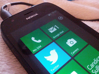 |
| Lumia - No SIM |
I really liked Windows Phone. This time last year I really had hope and expectation that Windows Phone on Nokia devices would be a success and satisfy my smartphone needs. I was so enamoured with the potential of the platform that I got a Nokia Lumia 710 which had Windows Phone 7.5 (Mango) running on it. One of the promises of Windows Phone on the Nokia Lumia line was that it would always get updates promptly, as the updates are pushed by Microsoft, so that there shouldn't be delays due to carriers and/or manufacturers. I was really enjoying using Microsoft's new mobile operating system, and the idea that there would be less of a fragmentation issue. (I had previously been scarred by my experience with an HTC Desire and slow updates to new Android versions)
Almost a year on I have fallen out of love with Windows Phone. When Windows Phone 8 was announced in 2012, it was also made abundantly clear that existing hardware running Windows Phone 7.5 would not be upgraded to Windows Phone 8. Details of the Windows Phone 7.8 update leaked and then were announced, but I still was disappointed by the no Windows Phone 8 issue.
Using the Nokia Lumia 710 on a daily basis, alongside at least one Nexus device (a Nexus S, then a Galaxy Nexus and now a Nexus 4), I had a few little things that kept on annoying me. First off using Gmail was overall a pretty good experience, apart from slightly slower updates than on my Android devices and that any time I replied to an email from the Lumia 710 I broke the conversation in web view for myself and everyone else. Secondly there is a lack of apps to satisfy many of my online needs. No Google Plus app, and having to fall back to a horrible web experience through Internet Explorer mobile was a real pain. No Instagram, painful Twitter experience, no Google Maps app and for a while no Google Maps through Internet Explorer mobile was annoying. The lack of an always on instant messaging client made things worse. One of the few reasons I stuck with the Nokia Lumia was that I always had an Android fallback device to do what I really wanted to do.
This time last year the user experience on the Nokia Lumia 710 was better than on most Android devices. The device and UI seemed more responsive and fluid. The Live Tiles UI was interesting and different as well as great for one hand use. Now, through Android 4.0 (Ice Cream Sandwich) and Android 4.1/4.2 (Jelly Bean) updates, lag on Android seems to be a thing of the past. The Android User experience is now superior and polished. The appeal of Windows Phone has faded.
It is sad, but on Saint Valentine's Day 2013 I'm officially breaking up with Windows Phone. I hope we can still be friends. I may make a booty call from time to time and pop my Micro SIM card into a Windows Phone to try it out or to review an app or service on it. My Nokia Lumia 710 may try and win me back if it ever updates to Windows Phone 7.8, if it succeeds I might blog about it through the Official Blogger App for Windows Phone (unlikely to ever be released).
I have to admit, I really am in love with Android.
As usual, feel free to leave comments and/or questions below.
