Yesterday evening I went through one of the things I do most often on my laptop/netbook/tablet/desktop/smartphone: I visited the BBC website to browse the news/sport/iPlayer content of the day. In this particular instance I was on my laptop (which is happily running
Linux Mint 12). Low and behold the BBC Homepage has switched to the new interface!
 |
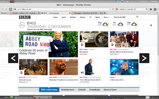
| The New BBC Homepage (First Page) |
I like the new BBC Homepage on
www.bbc.co.uk . The top bar remains static, with links to the main sections of the website (News, Sport, Weather, iPlayer, TV, Radio, More...). The bar beneath the top one is static as well, but contains an analogue clock, the date and weather snapshot (you can personalise this feed for wherever you are by simply entering your postcode). Below the two static bars at the top, content from the website is displayed as tiles with snapshot previews and easy to read symbols of the type of content contained within the tile. This user interface is in many ways similar to the
Windows Phone 7 Metro UI (tiles). I like it!
 |
| The lower section of the New BBC Homepage |
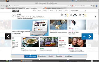
If you scroll down on the webpage you are presented with sections (tiles) specifically for the iPlayer, popular content on the website and a fuller selection of sections of the website. The website is designed as a 3x2 panel canvas so you can click on one of the large arrows at the right or left of the page to scroll through the content. The 3x2 panels are on a loop so once you click right from the 3rd panel you go back to the first one. The lower panels of the homepage are all populated by the same content as the first bottom one.
 |
| The New BBC Homepage (Second Page) |
 |
| The lower section of the New BBC Homepage (it's the same throughout) |
 |
| The New BBC Homepage (Third Page) |
As I have said in the past, I really like what the BBC have done with their website homepage. The new design is clean, sleek and magazine like. I love using the new website on my Archos 80 G9, the new design is particularly well suited for touch interface devices. Using the service and browsing the content easier and more intuitive. Well done to everyone involved in the redesign. I'm happy to see my TV License money being spent on improving the BBC services I receive.
As usual, feel free to leave comments and/or questions below or on the Google Plus link. Let me know how you get on with the new BBC Homepage.


