So, last week Microsoft launched Outlook.com, a refresh/relaunch of their webmail service. Outlook.com replaces existing Hotmail and Live user interface, beefs up the service and even gives users the opportunity to change their email domain from Hotmail.com to Outlook.com.
I've been using Outlook.com both through a new email address and with my existing Live account, so here are my impressions almost a week in.
The user interface, once you have either signed up or agreed to have your existing Hotmail/Live use the new UI, is clean. At launch, everyone was referring to the UI as the Metro one.
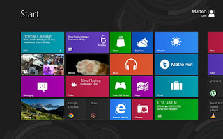
Metro UI is the design language/style used by Microsoft for their smartphones (running Windows Phone), the Xbox dashboard and on Windows 8. Later in the week, news broke of the fact that Microsoft staff and partners have been explicitly told not to use the term Metro UI, due to threat of legal action from Metro AG, a German retail group. Until Microsoft come up with a replacement name for their UI, I'll call it Metro UI.
 |
| My Winodows 8 Start screen. I call it Metro UI. |
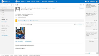
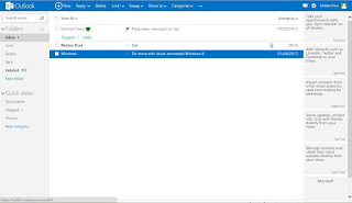
The clean UI on Outlook.com is a definitely better. The larger, more readable fonts and cleaner screen seem to be snappier than the now clunky Hotmail webmail. Media, such as images and video, can be set to open automatically within the email itself and images can also be viewed as a slideshow too.
 |
| An email with an image as an attachment. |
 |
| A gallery view of the image attachments. |
From the Outlook.com webmail page you can also chat with your MSN/Windows Live chat buddies, integrate your Facebook chat and soon you will be able to make and receive Skype voice and video calls. I'm looking forward to seeing how the Skype from Outlook.com compares to Google Talk from Gmail.
I have refrained from transferring my Live account over to the Outlook.com domain because of all the other services tied to my Live email address, mainly Xbox Live and my Windows Phone Nokia Lumia. Apparently switching your address to an Outlook.com one can break those services and accounts.
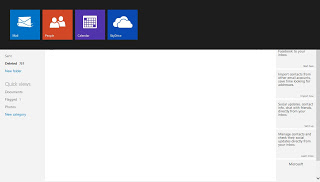
Outlook.com is obviously not finished yet. Clicking on the logo in the top left corner of the page, you get to switch from your webmail to other services such as People (contacts), Calendar and Skydrive. People is using the Metro UI design language, but Calendar and Skydrive are still using the old Hotmail/Live UI. I look forward to seeing how those services behave using the Metro UI.
 |
| Metro UI switcher to the other account services. |
My Outlook.com email address synchronises perfectly with my Nokia Lumia 710, and it is as good an experience on the Windows Phone platform as Hotmail was. Essentially, nothing is new there. On Android, you can add an Outlook.com email account to the Hotmail application and get your email on the go there. My personal view on the Hotmail for Android app: it's pants, don't bother trying!
This Outlook.com webmail refresh is a good start for Microsoft, I like the shinily simple UI and service. Is it enough to win me over? Currently I'm locked into Google's services and webmail service, GMail, so it will be tough for Microsoft to do so. Check back in a few months time and see if I have changed...
These are the views of an Android fanboy, bear that in mind. As usual, feel free to leave comments and/or questions below.
